“We are very lucky to have an information architect on our block to develop our ‘new and improved’ website that will be informative for all our residents.”
I am a gardener and I think of ideas in the same way. This space is for growing some of these thoughts, tending them, and showing off the harvest. It's an organic thing and there may be a few weeds, but that's really OK.
Saturday, May 31, 2014
West 104th Street Block Association Talks IA
Sunday, April 20, 2014
Site Maps and Variations: A Real World Review
A sitemap is a useful tool both for users and designers of a web interface. Designers use sitemaps to visualize website navigation, while users rely on them in combination with search and browsing to help them find what they are looking for. A third user, search engines, rely on sitemaps in part to index websites. Increasingly, designers are integrating sitemaps and subsets of sitemaps directly into website navigation. For this report, I reviewed the literature on sitemaps to see how they have evolved as a tool for design and navigation and explore new uses and variations.
Background and Definitions
Much of the earliest literature on sitemaps describe them as a tool to help users navigate a website. A sitemap in this context is a page on a website that displays an organized list of links to every page on the site. In the 2002 edition ofElements of User Experience, Jesse James Garrett describes sitemaps as tools designers use to develop the structure of a website.
Sitemaps are also used as tools for design. Dan Brown (2011, p. 94) defines sitemaps as “A visual representation of the relationships between different pages on a web site. Also known as a structural model, taxonomy, hierarchy, navigation model, or site structure.” According to Brown, website designers, developers, project managers and stakeholders use site maps to:
- Clarify information hierarchy,
- Establish a navigational backbone, and
- Facilitate content migrations.
Because of the dual use of sitemaps as a tool for design and as a navigational feature of a website, Jesse James Garrett recommends referring to a sitemap, the design tool, as an architectural diagram (Garrett, 2002, p. 17). Peter Morville and Louis Rosenfeld (2002) prefer the term blueprint, which also borrows from the terminology of physical architecture, but can be confused with other information architecture tools, such as wireframes, which employ the conventions of architectural blueprints, such as monochrome color scheme and annotation. In referring to the design tool, I prefer the term sitemap, because it conveys a sense of the orientation and context of site content, rather than instructions for building a site.
Sitemaps as a Design Tool
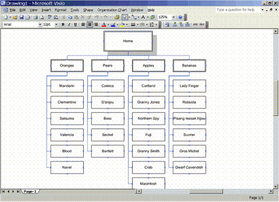
Designers use sitemaps to develop a new site structure, create a current view of website content and to analyze gaps in content or problems in the arrangement of content (Brown, p. 95). Sitemaps are often created using a drawing tool such as Microsoft Visio or PowerPoint, but can also be represented in Excel. Drawing tools allow you to map relationships between pages by grouping boxes and connecting them with lines, much like an organizational chart. The following sitemap is the result of importing an Excel file into Visio:
Figure 1: Sitemap from The Lazy IA’s Guide to Making Sitemaps (Turbek, 2006).
The presentation of a sitemap as a series of hierarchical boxes with interconnecting lines is useful in diagramming the relationships between content on a section of a website or within an entire website. These diagrams are rarely seen by website users, though the resulting structure informs the site navigational structure of the website and may be represented in a page on the website itself.
Sitemaps as a Navigation Tool
From a user’s perspective, “A site map’s main benefit is to give users an overview of the site’s areas in a single glance by dedicating an entire page to a visualization of the information architecture” (Nielsen, 2002). We think of user experience as a somewhat recent development in the design of interactive products. However, in an even earlier article about sitemaps, Peter van Dijck (1999) stresses that the user experience is paramount when developing a sitemap.
Van Dijck says that because users are looking for something specific on a website, the sitemap should be complete, so they can find it. Second, he says that since users are on a website to find information that is enjoyable and of interest, the sitemap should also include meta-information to help the user decide if the effort of clicking on a link is worth it. These are two requirements for sitemaps: completeness and meta-information. He suggests grouping pages within like ideas, highlighting the most popular pages in bold or color coding links. Most sitemaps follow this concept by grouping pages by top-level navigation and utility, or meta, navigation. Some also group links into facets in addition to the more traditional sections, but the goal is to present a visualization of every page on the website in one place, which is useful as a secondary navigation tool.
A 2002 study by Jakob Nielson provided a number of suggestions for effective sitemaps. It recommended that websites include a link to the sitemap on every page, clearly labeled “site map.” It also indicated that sitemaps should be relatively short, no more than two and a half times the window size. It recommended that layers of hierarchy are acceptable if designed well, i.e. simple and compact. It also suggested that interactive sitemaps can be confusing and should be avoided.
As for level of detail, Garrett (2002) states that a sitemap on a website should only show one to two levels of the site, rather than a complete map of every page. Nielsen, however, says a complete map is best for small sites, but that several levels can be displayed if the sitemap is designed well. Search engine optimization expert, Shari Thurow, recommends having a complete sitemap to improve accessibility by search engines (S. Thurow, personal communication, November 29, 2013).
Nielson also concluded, “…users are reluctant to use site maps and sometimes have problems even finding them.” In the study, only 27% of users turned to sitemaps to find information. Nielsen found that less than half of the sites included in his book, Homepage Usability, had sitemaps at all. Nielsen inferred that perhaps users didn’t expect a site to have a sitemap and simply didn’t look for them.
In a 2008 follow-up to his first sitemap study, Nielsen reported that sitemaps remain useful as a secondary navigation aid, despite the fact that sitemap usage fell to only 7% of users in the later study versus 27% in 2002, because “they’re the only feature that gives users a true overview of everything on a site.” He justified sitemaps because they don’t hurt people who don’t use them, they help those who do use them, and they are relatively inexpensive to produce (Nielsen, 2008).
Sitemap Alternatives
Nielsen notes, “Users go to site maps if they are lost, frustrated, or looking for specific details on a crowded site” (Nielsen, 2002). He likes sitemaps because they offer a clean, simple website overview and represent an alternative finding aid in what may be a cluttered website. I thought it might be interesting to look at some of the alternative variations on sitemaps that help users find content. It turns out that Nielsen has much to say about these alternatives as well.
Mega Drop-Down Menus
Nielsen (2009) refers to a study of “mega drop-down menus,” which are navigational features, often integrated with global navigation. Mega drop-down menus, also described as “fat menus,” are ways for site designers to include subpage navigation by segmenting content into groupings or popular links.
According to Nielsen, mega drop-down menus have the following characteristics:
- Large, two-dimensional panels with options divided into groups
- Choices are structured through layout and typography, and may use icons
- Everything is visible at the same time without scrolling
- Content is displayed in a vertical or horizontal form (drop-down for horizontal global navigation and fly-out for left navigation bars).
Mega drop-down menus allow the addition of featured content as a way to promote or market specific pages within the selected section. The Wall Street Journal includes featured content, such as blogs, videos and magazine content in their mega drop-down menus:
Figure 2 Wall Street Journal Mega Drop-Down Menu
Nielsen’s 2009 study concludes that Mega drop-downs work because “…they show everything at a glance, so users can seerather than try to remember.” This goes back to Nielsen’s earlier work on usability that recommends interfaces that rely on recognition rather than recall (Nielsen, 1995).
Why else do mega drop-down menus work? First typical drop-down menus often hide options. Mega drop-down menus contain all of the user’s options for a particular section in a single panel so they do not need to rely on memory. Also, regular drop-down menus don’t support groupings while a mega drop-down’s card or panel layout does. Finally, mega drop-down menus make it easy to include rich typography, images and illustrations.
Retail often also include fat menus with links to sales, promotional features and facets like “Gifts for Her,” which drive sales toward specific pages, as in the following fat menu from Bodenusa.com:
Figure 3 Boden Mega Drop-Down Menu
Applying a sitemap as a tool for design, an information architect can look at a shopper’s mental model and user scenarios when shopping within a particular category, and suggest facets and features to include in fat menus. The resulting menu design can then be tested on actual users to determine if the links are appropriate and if they are likely to drive sales.
Doormat Menus
Similar to the mega drop-down menu is the “doormat navigation” design pattern described in the Nokia Developers website and Welie.com. Both display a panel of organized links to content, except the doormat navigation is typically only displayed on the home page, thus the “doormat” reference, and often displays each top-level navigation item in the same panel with sub-groupings of links, rather than focusing on a single top-level section (Welie.com).
Welie.com’s description of doormat navigation suggests that the panel contains sub-section links for each major section, while the Nokia Developers site shows doormat navigation images that are specific to a single site section (Mobile web design: doormat navigation, n.d.). Both Welie.com and Nokia note that doormat navigation is best placed on the home page of large websites with a lot of content, while Neilsen assumes mega drop-down menus would be accessible from every page of the website.
Doormat navigation may be falling out of favor or evolving toward the mega drop-down menu format. Welie.com displays an example of a doormat navigation from Adobe.com; however, Adobe’s current website features mega drop-down menus.
Footer Sitemaps
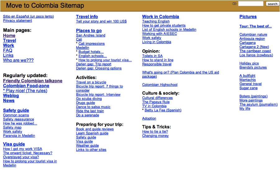
Van Dijck’s 1999 article is also a very early example of placing the sitemap on the footer of every page. An example of this method is presented on the travel site, Poor But Happy: Colombia. In fact, footer sitemaps, also called “fat footers,” do not appear to have been common before 2009, based on a scan of literature on the topic.
Figure 4 Poor But Happy: Colombia Sitemap Footer (van Dijck, 2000).
In contrast to van Dijck’s sitemap footer, recent fat footers typically present an abbreviated list of links to major sub-pages of each top-level section, rather than a complete sitemap. Below is a fat footer from the Wall Street Journal:
Figure 5 Wall Street Journal Footer
In Jakob Neilsen’s 2012 article on “SEO and Usability,” he cautions against attempting to stuff fat footers or menus with an entire website. Carefully curated footer content can strengthen structural SEO by guiding link juice to the site’s best pages about each key topic” (Nielsen, 2012). This needs to be balanced by keeping the information compact and scannable enough to prevent confusing the user.
I interviewed search engine optimization expert, Shari Thurow, to explore further the effect of fat menus and footers on search engine optimization and findability. She agrees with Nielsen. Thurow said, “Too many links on a page, unless it is a page where humans expect a lot of links (site map/index, top-level category page, View all page, etc.) actually impedes findability. So mega menus should not be too large, ironically” (S. Thurow, personal communication, November 29, 2013). Having a complete sitemap on every page, as van Dijck recommended, may dilute the effectiveness of the search engine optimization strategy as well.
Thurow notes that it is also helpful that menus are coded in a way that is crawlable by search engines and visible to screen readers. Not all menu scripts are accessible. She further recommends that a sitemap page include not only organized links of all site content, but also annotations that provide “…keyword-rich content for the search engines to spider” (Thurow & Musica, 2009, p. 118). Additionally, Thurow suggests that fat menus and sitemaps by themselves are not enough. She notes that “..wayfinder pages, like a Brands A-Z page, are really helpful for both humans and search engines” (S. Thurow, personal communication, November 29, 2013).
XML Sitemaps
The ability of search engines to spider library catalogs and other so-called deep Web content is a challenge. Vinit Kumar of the Institute of Library and Information Science, Bundelkhand University, experimented with developing an XML sitemap that can be read by search engines to expose OPAC content to search engines (Kumar, 2012). He presents two ways to create these sitemaps via locally run, hand-coded routines or remote sitemap generation services (p. 495-496). Some local routines include GSiteCrawler (http://gsitecrawler.com/), G-Mapper (http://www.dbnetsolutions.co.uk/gmapper/), and WebDesignPros Sitemap Generator (http://www.webdesignpros.ca).
Remote services include Google Webmaster tools and search engine-specific tools that access a website’s sitemap page. Kumar notes that for most of the remote services, the OPAC data needs to be publicly available in order to be spidered. If the OPAC data is obscure, then additional coding or a local option may be necessary.
XML sitemaps also provide the benefit of encoding semantic web metadata, which offer another tool for the information architect to express meaning within a sitemap. Further research is required to test how XML sitemaps may offer benefits such as improved search and discovery.
The Future of Sitemaps
According to Dan Brown, sitemaps continue to be useful in representing content for structuring websites, despite the increasing complexity of the Web (Brown, 2011, p. 122). Sitemaps are effective tools for conceiving the overall structure of a website, but are limited in their ability to depict dynamic and user generated content accurately.
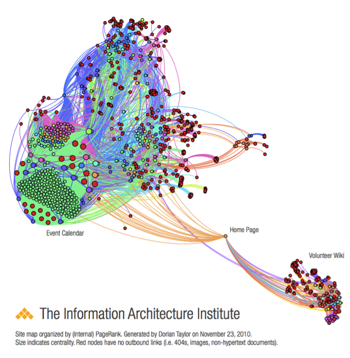
Victor Lombardi, a founder of the IA Institute, recently started a thread on iai-members discussion list on how to create a sitemap for data (Lombardi, 2013). Dorian Taylor replied with a suggestion to use Gephi, a data visualization tool, to represent the content in a network graph. In an earlier blog post, Taylor presented an example of a Gephi visualization of the IA Institute’s website that he created by using RDF data obtained from a crawler he designed (Taylor, 2011). The resulting graph presents a semantic diagram that according to Taylor precludes the need for sections because the necessary semantic relationships are already built into the RDF metadata for the links between pages.
Figure 6: Gephi Sitemap Diagram of IAInstitute.org
A sitemap as network graph is an interesting idea, but it would require user testing to understand whether website users find it easy to use. As noted above, Nielsen (2002) suggests that interactive maps should be avoided because it may confuse users. On the other hand, this type of visualization is excellent for analyzing gaps in content and natural groupings of concepts and information. That a sitemap such as this can be generated on the fly presents an interesting alternative for mapping dynamic websites and could use more exploration.
Nielsen (2002) predicted that updated versions of browsers, such as Internet Explorer, might include tools that automatically produce a usable, interactive sitemap, but pokes fun at Microsoft for not adopting feature requests quickly. Kumar returns to the idea of built-in browser assistance by noting that libraries could develop a browser plug-in to support search of library OPACs. This would allow patrons to search for catalog content within their browser’s search bar rather than directly in the OPAC. Another approach could be to code the search results so that catalog content is presented first in the results page. Without additional coding, it remains true that the designer must optimize website navigation rather than expect the browser to provide sitemap tools.
Conclusion
Sitemaps are useful tools for website design, search and navigation. Because of the evolving nature and increasing complexity of the Web, the role of the sitemap is also evolving. The sitemap is an important aid to navigating complexity for all users, whether designers, stakeholders, site users. As Brown (2011, p. 122) suggests in his conclusion to the Site Map chapter, the growing complexity is making sitemaps more important, not less so. With the increasing power of visualization and semantic web tools, we can anticipate interesting new uses of sitemaps as an analytical and navigation tool.
References
Brown, D. M. (2011). Communicating design: Developing web site documentation for design and planning. Berkeley, CA: New Riders.
Doormat navigation. Welie.com. Web. Retrieved on November 20, 2013 fromhttp://www.welie.com/patterns/showPattern.php?patternID=doormat
Garrett, J. J. (2002). Elements of user experience. Indianapolis, IN: New Riders.
Garrett, J. J. (2011). The elements of user experience: User-centered design for the Web and beyond. Berkeley, CA: New Riders.
Kumar, V. (2012). Exposing library catalogues to search engines. DESIDOC Journal Of Library & Information Technology, 32(6), 493-497.
Mobile web design: Doormat navigation. Nokia Developer. Web. Retrieved on November 20, 2013 fromhttp://developer.nokia.com/Community/Wiki/Mobile_Web_Design_:_Doormat_Navigation
Rosenfeld, L., & Morville, P. (2002). Information architecture for the World Wide Web. Sebastopol, Calif: O’Reilly.
Nielsen, J. (March 23, 2009). Mega menus work well for site navigation. Web. Retrieved on November 29, 2013 fromhttp://www.nngroup.com/articles/mega-menus-work-well/
Nielsen, J. (September 2, 2008). Site map usability. Web. Retrieved on November 29, 2013http://www.nngroup.com/articles/site-map-usability/
Nielsen, J. (January 6, 2002). Site map usability, 1st study. Web. Retrieved on November 29, 2013 fromhttp://www.nngroup.com/articles/site-map-usability-1st-study/
Nielsen, J. (January 1, 1995). Ten Usability Heuristics. Web. Retrieved on November 29, 2013 fromhttp://www.useit.com/papers/heuristic/heuristic_list.html
Nielsen, J. (August 13, 2012). SEO and Usability. Web. Retrieved on December 1, 2013 fromhttp://www.nngroup.com/articles/seo-and-usability/
Nielsen, J., & Tahir, M. (2002). Homepage usability: 50 websites deconstructed. Indianapolis, IN: New Riders.
Taylor, D. (2013, November 26). Site maps from data? Message posted to http://lists.iainstitute.org/private.cgi/iai-members-iainstitute.org/2013-November/010838.html
Taylor, D. (2011). Content Robo Inventory. Web. Retrieved on December 1, 2013 from http://doriantaylor.com/content-robo-inventory
Thurow, S., & Musica, N. (2009). When search meets web usability. Berkeley, Calif: New Riders.
Turbeck, S. (January 30, 2006). The lazy IA’s guide to making sitemaps. Boxes and Arrows. Retrieved on December 1, 2013 from http://boxesandarrows.com/the-lazy-ias-guide-to-making-sitemaps/
van Dijck, P. (1999). The problem(s) with sitemaps. Web. Retrieved on November 29, 2013 from http://evolt.org/node/710/
van Dijck, P. (2000). Poor hut happy: Colombia. Web. Retrieved on November 29, 2013 from http://web.archive.org/web/20001204205500/http://poorbuthappy.com/colombia/index.html
Sunday, April 06, 2014
West 104th Street Block Association Moves Ahead with Re-Design
Wednesday, February 26, 2014
Stump and Moo
…and for my first piece of post-MLIS magic, I started a project cataloging cows. Literally. It's a small cattle ranch management app and won't be public. Mostly coding and connecting to no-SQL database MongoDB, which is based in JSON and has interesting linked data possibilities.
I have also started interning at Architecture_MPS, an online architecture journal. I am developing an image archive of presidential campaign photos from 2000 to 2012. More when there is something to show.
Tuesday, January 14, 2014
Fall Projects: User Research
My Information Architecture class conducted a semester-long, group project to develop a website prototype for a small business or nonprofit group. My group, including Eleanor Meyer, Jan Diolola, Storey Radziunas and me, formed a group called Community Design and selected the West 104th Street Block Association as our client. Since I have a prior relationship with the block association as the caretaker of their digital newsletter repository, I had close access to members of the association board and the community and knew that their site was in desperate need of a facelift.
We each selected a different user population to study including senior citizens and older adults, families living in the neighborhood, young families considering a move to the neighborhood and couples without children. My group presented our design to the block association, who has agreed to adopt it for their next redesign. Next step is building the thing. Congrats, Team!
Read more about this project at my Pratt SILS E-Portfolio:
Wednesday, February 13, 2013
World IA Day: City Data
I presented an updated version of my IA for Emergency response presentation, this time focusing on the collection and dissemination of city data and community engagement and how information architects and design professionals can participate.
I am working on a collection of presentations and talk summaries that will be posted to the World IA Day website.
Friday, July 13, 2012
Information Architecture of Emergency Response (for Designers)
Tuesday, May 29, 2012
The Information Architecture of Emergency Response
Commiserating with some of my colleagues with whom I helped create the NYC GeoSymposium 2001-2011-2021 back in November, we have found that in each of our practices, cartographers, GIS specialists and those working with visualizing location based information are finding a great need for design assistance. This seems natural, if somewhat belated and perhaps even surprising. Think of some of the most beautifully designed images and one must of course reflect on the maps of National Geographic magazine, those gorgeous squares of folded paper that come in every issue. Certainly, there is a longstanding sensibility around the design of useful and pleasing maps. Increasingly, these maps are in our hands on tablets and smart phones, so optimizing the display of information that used to be represented in enormous, rolled or folded pieces of paper is a challenge for our community.
Let's Talk About Maps
So I am doing my part in continuing this discussion of the place for design in online mapping. In March, I presented a talk in New Orleans at the 2012 IA Summit on The Information Architecture of Emergency Response. The presentation explored the evolution of technology in emergency response, with a special focus on advances in geographic systems, incident management, social media and policy in New York City since September 11, 2001. In it, I cover questions like:
- What technologies do emergency responders in NYC use?
- How have events like 9/11 and other incidents influenced technology advances?
- What effect, if any, has the change from a Law Enforcement Mayor to a Media Mayor had on data policy?
- What are the challenges and opportunities of open government data?
- How is social media being used in NYC and elsewhere to engage the public in emergency preparedness and response?
- And, finally, are app contests and hackathons an effective way to improve public services in difficult economic times?
I reprised the presentation, modified somewhat for an emergency responder audience for the Office of Emergency Management's annual Women's History Month Breakfast, where I had the pleasure of sharing the stage with Dr. Irene Osborne of Mount Sinai Hospital, who treated patients' internal injuries during the Haiti earthquake, and IA Institute founder and Development Manager, Bev Corwin, who presented on language translation in crisis situations, in particular a handheld Creole language translation device that she developed with colleagues at Carnegie Mellon University.
Continuing the Discussion
I have been asked to present another redux of Information Architecture of Emergency Response at the IxDA NYC's July meetup. I hope to conclude the IxDA with a Town Hall discussion of how the IA community can support emergency response efforts throughout each of our own neighborhoods. I ran out of time in New Orleans and would like to get a good conversation going with the UX community on issues and ideas for further exploration. My daughter's 6th grade graduation is June 7, so I will be missing the IxDA meeting that focuses on the Social Lives of Maps, with UX designer Ray Cha and Green Map's Thomas Turnbull. But I understand the GIS community will have someone there. If you attend, please introduce yourself to Jack Eichenbaum, who founded GISMO, a 20+ year old, NYC-based GIS user group. In the meantime, stay tuned for RSVP information for the July event.It may also be interesting for my UX friends to hear (as I've heard through the grapevine) that ESRI, leader in GIS software, is developing an internal UX practice and should be hiring soon.
Slide decks of my IA of Emergency Response talks are now available at Slideshare:
March 23:
March 28:
Monday, December 12, 2011
World IA Day Announces 14 Locations
1 DAY. 14 CITIES.
World IA Day 2012 is about bringing the Information Architecture community together. We’re fostering links within local communities and on a global scale. We’re sharing information, ideas and research. And we’re doing it through unconventional, exciting and engaging IA events this February.
The first ever World IA Day focuses on Designing Structures for Understanding. On February 11, 2012, we’re hosting WIAD events in 14 cities across all corners of the globe. Learn from world-class IA minds, network, showcase new ideas and attend events tailored specifically to your community. We hope you’ll join us at an event near you this February!
Local Connections. Global Impact. World IA Day 2012
WIAD2012 Locations:
Bogota, Colombia
Vancouver, Canada
Sao Paulo, Brazil
Los Angeles, CA, USA
Ghent, Belgium
Kuala Lumpur, Malaysia
Italy (Milan, Rome, Sardegna)
Panama City, Panama
Bucharest, Romania
Paris, France
Sydney, Australia
Malmo, Sweden
Johannesburg, South Africa
Tokyo, Japan
Ann Arbor, MI, USA
Visit http://worldiaday.org/ for details.
Thursday, August 11, 2011
IA Institute Newsletter #6.05 Released
IA Institute just released Newsletter #6.05 with Part Two of Finding IA at the Enterprise Search Summit by Shari Thurow, a follow up to my article from the previous newsletter.
http://iainstitute.org/news/001263.php
The Journal of Information Architecture released Issue 1, Volume 3 with a focus on the unique way of seeing what Jorge Arango terms "Environments for Understanding" and how they persist across channels and media.
http://journalofia.org
Also the long awaited IA issue of the ASIS%T Bulletin is out:
http://www.asis.org/bulletin.html
And if that's not enough, here's an inspiring blog post on "Information Architecture," building bridges and making maps from Peter Morville:
http://semanticstudios.com/publications/semantics/000647.php
I've got a lot of reading to do....
Wednesday, July 13, 2011
Conversations with Richard Saul Wurman
So what a treat to find out about Richard Saul Wurman's newest venture, the WWW.WWW Conference, which will celebrate improvised conversation.
WWW.Wow. Where else could you find TED founder Richard Saul Wurman, Yo Yo Ma, Herbie Hancock and ESRI's Jack Dangermond all in one place? It's the WWW.WWW Conference, currently planned for September 18/20, 2012.
A unique un-conference that pairs up incredible minds for brief chats in a single venue. No presentations. No schedule. Just 100 interesting people and 50 conversations.
Richard Saul Wurman, who also founded TEDMED and the eg conferences, and coined the term "information architect" in 1976, is himself a M.Arch graduate who has been exploring the themes of design and place and livable urban environments since the sixties, so it is fitting that ESRI president and fellow mapping pioneer, Jack Dangermond should host the conference. You will recognize other great names associated with the event incuding glass artist Dale Chihuly, who will create an installation for the event and SEED Media Goup's Adam Bly as Science Curator. SEED was an original creator of what was to become my all-time favorite MOMA show, Design and the Elastic Mind.
The event will be streamed live to multiple locations and the talks will also be available via a yet-to-be-released, multi-platform tablet application.
Watch http://www.thewwwconference.com for details.
I won't want to miss the conversation, so I've already added it to my calendar.
Tuesday, July 12, 2011
I Joined Google+ Today
Just like Facebook, only better.
I've always liked that Facebook lets you group people. It's so natural. I tend to get frustrated by LinkedIn's degrees of separation - you are either in someone's network or you have someone or a chain of people between you and the other person. In a way this is nice because you are still able to contact people in your second network while preserving how you know that person (so and so's friend). Without a grouping feature, once you accept a person to your network on LinkedIn, you lose information about how you are connected to your new contact, unless you go to their page to see shared contacts.
Circles makes Google+ more personal and organized than LinkedIn. It is also more spare, sort of like the defunct Facebook Lite, but I'm witholding judgement for now. Facebook ended up dropping its Lite feature, and I suspect Google will eventually add in Facebook-like distractions and ads, since advertising is their ballywick.
If you are interested in learning more, let me know and I'll invite you to my Circle.
Saturday, June 25, 2011
Finding IA at the Enterprise Search Summit
Last month in May, I had the pleasure of attending the Enterprise Search Summit East in New York City with IA Institute board member, Shari Thurow. Shari and I were on a quest to discover the role of information architecture in Enterprise Search. We didn't have to look too far, as both days were keynoted by IA Institute veterans: former IA Institute president and CEO of FatDux, Eric Reiss, on Day 1 and IA Institute founder and Principal and Senior Consultant at InfoCloud Solutions, Inc., Thomas Vander Wal, on Day 2 . Institute founder Bev Corwin was also in attendance and I quite was pleased to make a personal connection with a former coworker from PricewaterhouseCoopers, whom I hadn't seen in ten years.
In Reiss's keynote, "The Dumbing Down of Intelligent Search," he challenged search professionals to have the user, not the application, serve as the frame of reference for search. Using Google as an example, Eric showed how the algorithm may not provide the correct context. Those who build the algorithm need to ensure that contextual metadata is available in the CMS. Eric also challenged implementers to understand the business and educate the content providers of those needs. "Matching patterns is not the same as matching needs," he explained. And lest the users themselves forget their own power, Eric encourages all users to be critical and experiment, learn basic strategies and not to take for granted that the search solution is intelligent.
Thomas Vander Wal's keynote on Day 2, "The Search for Social," was a fitting bookend, showing how to deal with all the input once your Enterprise Search team has embraced the user. VanderWal described tools that go beyond searching for artifacts such as documents, emails and image/video content to searching for human resources, knowledge and expertise within the enterprise. Many presenters demonstrated social search tools for finding user profiles, activity streams and Yahoo! Answers-style knowledgebases.
Tuesday, February 22, 2011
Highlights of the 2010 Salary Survey include:
Median Salary:
The highest salary range was a tie between the USD$80,000-90,000 and USD$90,000-100,000 ranges, each representing 12.8% of the total responses.
The average salary was estimated to be USD$95,252, up $5,252 from 2009.
Freelance Rates:
Excluding outliers, the average freelance rate was USD$88.65, up USD$3.65 over 2009. The median rate was USD$85.00 and the modal rate was USD$100.00, with eight people indicating that rate.
Thursday, July 30, 2009
The 2009 IA Institute Salary and Benefits Survey Opens
http://www.surveymonkey.com/s.aspx?sm=rnk5PuDVMuIRC1QwwS9PtA_3d_3d
The survey takes only a minute or two to complete, so we hope you'll stop by and contribute.
We have made slight edits from last year including a much simpler matrix of responses for IA related tasks, a more normalized breakdown of salary ranges and a further refinement of job titles and experience levels. I enjoyed reviewing last year's comments regarding medical benefits especially in light of current debate over US healthcare, but because we are an international organization, we went for simple this year and made only a few minor changes.
As in previous years, the survey will remain open through October, and we will post the results on the IAI website in late November/early December.
Wednesday, January 03, 2007
Questions for Prospective IAs
Wednesday, September 20, 2006
Wednesday, February 15, 2006
Taxonomy at The Economist
Names for sale
Feb 9th 2006
From The Economist print edition
The ancient science of taxonomy might benefit from a little modern marketing
http://www.economist.com/displaystory.cfm?story_id=5494618
Today we have naming of parts
Feb 9th 2006
From The Economist print edition
A global registry of animal species could shake up taxonomy
http://www.economist.com/displaystory.cfm?story_id=5492016
Biomechanics of Way Finding
Not yet available online, but available at newstands:
http://www.naturalhistorymag.com/0306/0306_toc.html
Wednesday, June 29, 2005
IA/UX Salary Surveys
Very few of the postings I receive on the IA Institute Job Board have salary information, but a typical salary/rate conversion is:
salary = 2/3 rate times 2080 (40 hours per week for a year)
The 1/3 reduction represents the cost of your medical, vacation and other benefits plus social security taxes that the company pays.
For $75/hour, this equals $104,000/year, which appears to be on the high end for those jobs where I do have salary data. Salary.com shows salary+bonus capping around 110K for most experienced IA/UX type jobs, although their job titles don't conform perfectly to the industry yet.
The IA Institute is supposed to publish the results of the 2005 survey this month. They are a bit behind schedule, but keep looking for the survey at http://www.iainstitute.org.
Some other surveys:
2004 UX Salary Survey
http://www.spiritsoftworks.com/resources/2004-salary-survey.htm
2003 AIfIA Salary Survey
http://iainstitute.org/pg/salary_survey_2003.php
IA Wiki - links to more salary surveys
http://www.iawiki.net/SalarySurveys
Salary.com Salary Wizard
http://www.salary.com/salary/layoutscripts/sall_display.asp
Since Salary.com job titles don't appear to reflect titles used in the IA industry, here are some equivalent job titles:
Interface Designer = User Experience & HCI
Content Engineer = Information Architect