A sitemap is a useful tool both for users and designers of a web interface. Designers use sitemaps to visualize website navigation, while users rely on them in combination with search and browsing to help them find what they are looking for. A third user, search engines, rely on sitemaps in part to index websites. Increasingly, designers are integrating sitemaps and subsets of sitemaps directly into website navigation. For this report, I reviewed the literature on sitemaps to see how they have evolved as a tool for design and navigation and explore new uses and variations.
Background and Definitions
Much of the earliest literature on sitemaps describe them as a tool to help users navigate a website. A sitemap in this context is a page on a website that displays an organized list of links to every page on the site. In the 2002 edition ofElements of User Experience, Jesse James Garrett describes sitemaps as tools designers use to develop the structure of a website.
Sitemaps are also used as tools for design. Dan Brown (2011, p. 94) defines sitemaps as “A visual representation of the relationships between different pages on a web site. Also known as a structural model, taxonomy, hierarchy, navigation model, or site structure.” According to Brown, website designers, developers, project managers and stakeholders use site maps to:
- Clarify information hierarchy,
- Establish a navigational backbone, and
- Facilitate content migrations.
Because of the dual use of sitemaps as a tool for design and as a navigational feature of a website, Jesse James Garrett recommends referring to a sitemap, the design tool, as an architectural diagram (Garrett, 2002, p. 17). Peter Morville and Louis Rosenfeld (2002) prefer the term blueprint, which also borrows from the terminology of physical architecture, but can be confused with other information architecture tools, such as wireframes, which employ the conventions of architectural blueprints, such as monochrome color scheme and annotation. In referring to the design tool, I prefer the term sitemap, because it conveys a sense of the orientation and context of site content, rather than instructions for building a site.
Sitemaps as a Design Tool
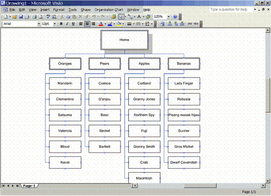
Designers use sitemaps to develop a new site structure, create a current view of website content and to analyze gaps in content or problems in the arrangement of content (Brown, p. 95). Sitemaps are often created using a drawing tool such as Microsoft Visio or PowerPoint, but can also be represented in Excel. Drawing tools allow you to map relationships between pages by grouping boxes and connecting them with lines, much like an organizational chart. The following sitemap is the result of importing an Excel file into Visio:
 Figure 1: Sitemap from The Lazy IA’s Guide to Making Sitemaps (Turbek, 2006).
The presentation of a sitemap as a series of hierarchical boxes with interconnecting lines is useful in diagramming the relationships between content on a section of a website or within an entire website. These diagrams are rarely seen by website users, though the resulting structure informs the site navigational structure of the website and may be represented in a page on the website itself.
Sitemaps as a Navigation Tool
From a user’s perspective, “A site map’s main benefit is to give users an overview of the site’s areas in a single glance by dedicating an entire page to a visualization of the information architecture” (Nielsen, 2002). We think of user experience as a somewhat recent development in the design of interactive products. However, in an even earlier article about sitemaps, Peter van Dijck (1999) stresses that the user experience is paramount when developing a sitemap.
Van Dijck says that because users are looking for something specific on a website, the sitemap should be complete, so they can find it. Second, he says that since users are on a website to find information that is enjoyable and of interest, the sitemap should also include meta-information to help the user decide if the effort of clicking on a link is worth it. These are two requirements for sitemaps: completeness and meta-information. He suggests grouping pages within like ideas, highlighting the most popular pages in bold or color coding links. Most sitemaps follow this concept by grouping pages by top-level navigation and utility, or meta, navigation. Some also group links into facets in addition to the more traditional sections, but the goal is to present a visualization of every page on the website in one place, which is useful as a secondary navigation tool.
A 2002 study by Jakob Nielson provided a number of suggestions for effective sitemaps. It recommended that websites include a link to the sitemap on every page, clearly labeled “site map.” It also indicated that sitemaps should be relatively short, no more than two and a half times the window size. It recommended that layers of hierarchy are acceptable if designed well, i.e. simple and compact. It also suggested that interactive sitemaps can be confusing and should be avoided.
As for level of detail, Garrett (2002) states that a sitemap on a website should only show one to two levels of the site, rather than a complete map of every page. Nielsen, however, says a complete map is best for small sites, but that several levels can be displayed if the sitemap is designed well. Search engine optimization expert, Shari Thurow, recommends having a complete sitemap to improve accessibility by search engines (S. Thurow, personal communication, November 29, 2013).
Nielson also concluded, “…users are reluctant to use site maps and sometimes have problems even finding them.” In the study, only 27% of users turned to sitemaps to find information. Nielsen found that less than half of the sites included in his book, Homepage Usability, had sitemaps at all. Nielsen inferred that perhaps users didn’t expect a site to have a sitemap and simply didn’t look for them.
In a 2008 follow-up to his first sitemap study, Nielsen reported that sitemaps remain useful as a secondary navigation aid, despite the fact that sitemap usage fell to only 7% of users in the later study versus 27% in 2002, because “they’re the only feature that gives users a true overview of everything on a site.” He justified sitemaps because they don’t hurt people who don’t use them, they help those who do use them, and they are relatively inexpensive to produce (Nielsen, 2008).
Sitemap Alternatives
Nielsen notes, “Users go to site maps if they are lost, frustrated, or looking for specific details on a crowded site” (Nielsen, 2002). He likes sitemaps because they offer a clean, simple website overview and represent an alternative finding aid in what may be a cluttered website. I thought it might be interesting to look at some of the alternative variations on sitemaps that help users find content. It turns out that Nielsen has much to say about these alternatives as well.
Mega Drop-Down Menus
Nielsen (2009) refers to a study of “mega drop-down menus,” which are navigational features, often integrated with global navigation. Mega drop-down menus, also described as “fat menus,” are ways for site designers to include subpage navigation by segmenting content into groupings or popular links.
According to Nielsen, mega drop-down menus have the following characteristics:
Figure 1: Sitemap from The Lazy IA’s Guide to Making Sitemaps (Turbek, 2006).
The presentation of a sitemap as a series of hierarchical boxes with interconnecting lines is useful in diagramming the relationships between content on a section of a website or within an entire website. These diagrams are rarely seen by website users, though the resulting structure informs the site navigational structure of the website and may be represented in a page on the website itself.
Sitemaps as a Navigation Tool
From a user’s perspective, “A site map’s main benefit is to give users an overview of the site’s areas in a single glance by dedicating an entire page to a visualization of the information architecture” (Nielsen, 2002). We think of user experience as a somewhat recent development in the design of interactive products. However, in an even earlier article about sitemaps, Peter van Dijck (1999) stresses that the user experience is paramount when developing a sitemap.
Van Dijck says that because users are looking for something specific on a website, the sitemap should be complete, so they can find it. Second, he says that since users are on a website to find information that is enjoyable and of interest, the sitemap should also include meta-information to help the user decide if the effort of clicking on a link is worth it. These are two requirements for sitemaps: completeness and meta-information. He suggests grouping pages within like ideas, highlighting the most popular pages in bold or color coding links. Most sitemaps follow this concept by grouping pages by top-level navigation and utility, or meta, navigation. Some also group links into facets in addition to the more traditional sections, but the goal is to present a visualization of every page on the website in one place, which is useful as a secondary navigation tool.
A 2002 study by Jakob Nielson provided a number of suggestions for effective sitemaps. It recommended that websites include a link to the sitemap on every page, clearly labeled “site map.” It also indicated that sitemaps should be relatively short, no more than two and a half times the window size. It recommended that layers of hierarchy are acceptable if designed well, i.e. simple and compact. It also suggested that interactive sitemaps can be confusing and should be avoided.
As for level of detail, Garrett (2002) states that a sitemap on a website should only show one to two levels of the site, rather than a complete map of every page. Nielsen, however, says a complete map is best for small sites, but that several levels can be displayed if the sitemap is designed well. Search engine optimization expert, Shari Thurow, recommends having a complete sitemap to improve accessibility by search engines (S. Thurow, personal communication, November 29, 2013).
Nielson also concluded, “…users are reluctant to use site maps and sometimes have problems even finding them.” In the study, only 27% of users turned to sitemaps to find information. Nielsen found that less than half of the sites included in his book, Homepage Usability, had sitemaps at all. Nielsen inferred that perhaps users didn’t expect a site to have a sitemap and simply didn’t look for them.
In a 2008 follow-up to his first sitemap study, Nielsen reported that sitemaps remain useful as a secondary navigation aid, despite the fact that sitemap usage fell to only 7% of users in the later study versus 27% in 2002, because “they’re the only feature that gives users a true overview of everything on a site.” He justified sitemaps because they don’t hurt people who don’t use them, they help those who do use them, and they are relatively inexpensive to produce (Nielsen, 2008).
Sitemap Alternatives
Nielsen notes, “Users go to site maps if they are lost, frustrated, or looking for specific details on a crowded site” (Nielsen, 2002). He likes sitemaps because they offer a clean, simple website overview and represent an alternative finding aid in what may be a cluttered website. I thought it might be interesting to look at some of the alternative variations on sitemaps that help users find content. It turns out that Nielsen has much to say about these alternatives as well.
Mega Drop-Down Menus
Nielsen (2009) refers to a study of “mega drop-down menus,” which are navigational features, often integrated with global navigation. Mega drop-down menus, also described as “fat menus,” are ways for site designers to include subpage navigation by segmenting content into groupings or popular links.
According to Nielsen, mega drop-down menus have the following characteristics:
- Large, two-dimensional panels with options divided into groups
- Choices are structured through layout and typography, and may use icons
- Everything is visible at the same time without scrolling
- Content is displayed in a vertical or horizontal form (drop-down for horizontal global navigation and fly-out for left navigation bars).
Mega drop-down menus allow the addition of featured content as a way to promote or market specific pages within the selected section. The Wall Street Journal includes featured content, such as blogs, videos and magazine content in their mega drop-down menus:
 Figure 2 Wall Street Journal Mega Drop-Down Menu
Nielsen’s 2009 study concludes that Mega drop-downs work because “…they show everything at a glance, so users can seerather than try to remember.” This goes back to Nielsen’s earlier work on usability that recommends interfaces that rely on recognition rather than recall (Nielsen, 1995).
Why else do mega drop-down menus work? First typical drop-down menus often hide options. Mega drop-down menus contain all of the user’s options for a particular section in a single panel so they do not need to rely on memory. Also, regular drop-down menus don’t support groupings while a mega drop-down’s card or panel layout does. Finally, mega drop-down menus make it easy to include rich typography, images and illustrations.
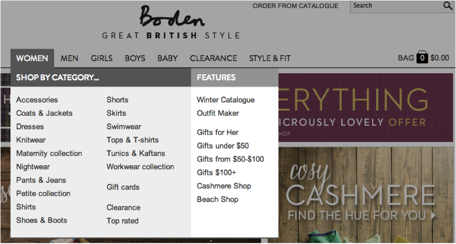
Retail often also include fat menus with links to sales, promotional features and facets like “Gifts for Her,” which drive sales toward specific pages, as in the following fat menu from Bodenusa.com:
Figure 2 Wall Street Journal Mega Drop-Down Menu
Nielsen’s 2009 study concludes that Mega drop-downs work because “…they show everything at a glance, so users can seerather than try to remember.” This goes back to Nielsen’s earlier work on usability that recommends interfaces that rely on recognition rather than recall (Nielsen, 1995).
Why else do mega drop-down menus work? First typical drop-down menus often hide options. Mega drop-down menus contain all of the user’s options for a particular section in a single panel so they do not need to rely on memory. Also, regular drop-down menus don’t support groupings while a mega drop-down’s card or panel layout does. Finally, mega drop-down menus make it easy to include rich typography, images and illustrations.
Retail often also include fat menus with links to sales, promotional features and facets like “Gifts for Her,” which drive sales toward specific pages, as in the following fat menu from Bodenusa.com:
 Figure 3 Boden Mega Drop-Down Menu
Applying a sitemap as a tool for design, an information architect can look at a shopper’s mental model and user scenarios when shopping within a particular category, and suggest facets and features to include in fat menus. The resulting menu design can then be tested on actual users to determine if the links are appropriate and if they are likely to drive sales.
Doormat Menus
Similar to the mega drop-down menu is the “doormat navigation” design pattern described in the Nokia Developers website and Welie.com. Both display a panel of organized links to content, except the doormat navigation is typically only displayed on the home page, thus the “doormat” reference, and often displays each top-level navigation item in the same panel with sub-groupings of links, rather than focusing on a single top-level section (Welie.com).
Welie.com’s description of doormat navigation suggests that the panel contains sub-section links for each major section, while the Nokia Developers site shows doormat navigation images that are specific to a single site section (Mobile web design: doormat navigation, n.d.). Both Welie.com and Nokia note that doormat navigation is best placed on the home page of large websites with a lot of content, while Neilsen assumes mega drop-down menus would be accessible from every page of the website.
Doormat navigation may be falling out of favor or evolving toward the mega drop-down menu format. Welie.com displays an example of a doormat navigation from Adobe.com; however, Adobe’s current website features mega drop-down menus.
Footer Sitemaps
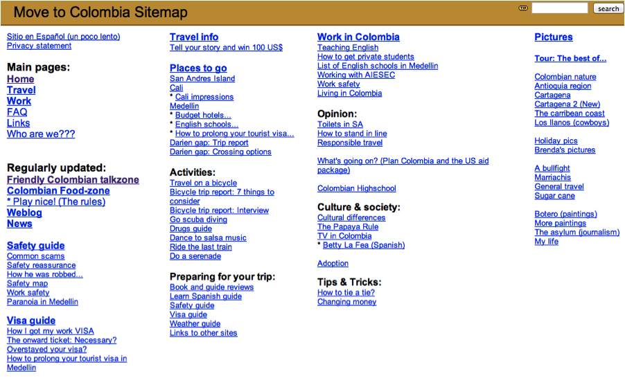
Van Dijck’s 1999 article is also a very early example of placing the sitemap on the footer of every page. An example of this method is presented on the travel site, Poor But Happy: Colombia. In fact, footer sitemaps, also called “fat footers,” do not appear to have been common before 2009, based on a scan of literature on the topic.
Figure 3 Boden Mega Drop-Down Menu
Applying a sitemap as a tool for design, an information architect can look at a shopper’s mental model and user scenarios when shopping within a particular category, and suggest facets and features to include in fat menus. The resulting menu design can then be tested on actual users to determine if the links are appropriate and if they are likely to drive sales.
Doormat Menus
Similar to the mega drop-down menu is the “doormat navigation” design pattern described in the Nokia Developers website and Welie.com. Both display a panel of organized links to content, except the doormat navigation is typically only displayed on the home page, thus the “doormat” reference, and often displays each top-level navigation item in the same panel with sub-groupings of links, rather than focusing on a single top-level section (Welie.com).
Welie.com’s description of doormat navigation suggests that the panel contains sub-section links for each major section, while the Nokia Developers site shows doormat navigation images that are specific to a single site section (Mobile web design: doormat navigation, n.d.). Both Welie.com and Nokia note that doormat navigation is best placed on the home page of large websites with a lot of content, while Neilsen assumes mega drop-down menus would be accessible from every page of the website.
Doormat navigation may be falling out of favor or evolving toward the mega drop-down menu format. Welie.com displays an example of a doormat navigation from Adobe.com; however, Adobe’s current website features mega drop-down menus.
Footer Sitemaps
Van Dijck’s 1999 article is also a very early example of placing the sitemap on the footer of every page. An example of this method is presented on the travel site, Poor But Happy: Colombia. In fact, footer sitemaps, also called “fat footers,” do not appear to have been common before 2009, based on a scan of literature on the topic.
 Figure 4 Poor But Happy: Colombia Sitemap Footer (van Dijck, 2000).
In contrast to van Dijck’s sitemap footer, recent fat footers typically present an abbreviated list of links to major sub-pages of each top-level section, rather than a complete sitemap. Below is a fat footer from the Wall Street Journal:
Figure 4 Poor But Happy: Colombia Sitemap Footer (van Dijck, 2000).
In contrast to van Dijck’s sitemap footer, recent fat footers typically present an abbreviated list of links to major sub-pages of each top-level section, rather than a complete sitemap. Below is a fat footer from the Wall Street Journal:
 Figure 5 Wall Street Journal Footer
In Jakob Neilsen’s 2012 article on “SEO and Usability,” he cautions against attempting to stuff fat footers or menus with an entire website. Carefully curated footer content can strengthen structural SEO by guiding link juice to the site’s best pages about each key topic” (Nielsen, 2012). This needs to be balanced by keeping the information compact and scannable enough to prevent confusing the user.
I interviewed search engine optimization expert, Shari Thurow, to explore further the effect of fat menus and footers on search engine optimization and findability. She agrees with Nielsen. Thurow said, “Too many links on a page, unless it is a page where humans expect a lot of links (site map/index, top-level category page, View all page, etc.) actually impedes findability. So mega menus should not be too large, ironically” (S. Thurow, personal communication, November 29, 2013). Having a complete sitemap on every page, as van Dijck recommended, may dilute the effectiveness of the search engine optimization strategy as well.
Thurow notes that it is also helpful that menus are coded in a way that is crawlable by search engines and visible to screen readers. Not all menu scripts are accessible. She further recommends that a sitemap page include not only organized links of all site content, but also annotations that provide “…keyword-rich content for the search engines to spider” (Thurow & Musica, 2009, p. 118). Additionally, Thurow suggests that fat menus and sitemaps by themselves are not enough. She notes that “..wayfinder pages, like a Brands A-Z page, are really helpful for both humans and search engines” (S. Thurow, personal communication, November 29, 2013).
XML Sitemaps
The ability of search engines to spider library catalogs and other so-called deep Web content is a challenge. Vinit Kumar of the Institute of Library and Information Science, Bundelkhand University, experimented with developing an XML sitemap that can be read by search engines to expose OPAC content to search engines (Kumar, 2012). He presents two ways to create these sitemaps via locally run, hand-coded routines or remote sitemap generation services (p. 495-496). Some local routines include GSiteCrawler (http://gsitecrawler.com/), G-Mapper (http://www.dbnetsolutions.co.uk/gmapper/), and WebDesignPros Sitemap Generator (http://www.webdesignpros.ca).
Remote services include Google Webmaster tools and search engine-specific tools that access a website’s sitemap page. Kumar notes that for most of the remote services, the OPAC data needs to be publicly available in order to be spidered. If the OPAC data is obscure, then additional coding or a local option may be necessary.
XML sitemaps also provide the benefit of encoding semantic web metadata, which offer another tool for the information architect to express meaning within a sitemap. Further research is required to test how XML sitemaps may offer benefits such as improved search and discovery.
The Future of Sitemaps
According to Dan Brown, sitemaps continue to be useful in representing content for structuring websites, despite the increasing complexity of the Web (Brown, 2011, p. 122). Sitemaps are effective tools for conceiving the overall structure of a website, but are limited in their ability to depict dynamic and user generated content accurately.
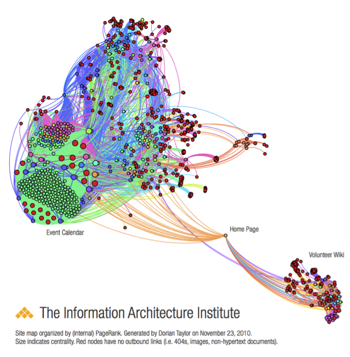
Victor Lombardi, a founder of the IA Institute, recently started a thread on iai-members discussion list on how to create a sitemap for data (Lombardi, 2013). Dorian Taylor replied with a suggestion to use Gephi, a data visualization tool, to represent the content in a network graph. In an earlier blog post, Taylor presented an example of a Gephi visualization of the IA Institute’s website that he created by using RDF data obtained from a crawler he designed (Taylor, 2011). The resulting graph presents a semantic diagram that according to Taylor precludes the need for sections because the necessary semantic relationships are already built into the RDF metadata for the links between pages.
Figure 5 Wall Street Journal Footer
In Jakob Neilsen’s 2012 article on “SEO and Usability,” he cautions against attempting to stuff fat footers or menus with an entire website. Carefully curated footer content can strengthen structural SEO by guiding link juice to the site’s best pages about each key topic” (Nielsen, 2012). This needs to be balanced by keeping the information compact and scannable enough to prevent confusing the user.
I interviewed search engine optimization expert, Shari Thurow, to explore further the effect of fat menus and footers on search engine optimization and findability. She agrees with Nielsen. Thurow said, “Too many links on a page, unless it is a page where humans expect a lot of links (site map/index, top-level category page, View all page, etc.) actually impedes findability. So mega menus should not be too large, ironically” (S. Thurow, personal communication, November 29, 2013). Having a complete sitemap on every page, as van Dijck recommended, may dilute the effectiveness of the search engine optimization strategy as well.
Thurow notes that it is also helpful that menus are coded in a way that is crawlable by search engines and visible to screen readers. Not all menu scripts are accessible. She further recommends that a sitemap page include not only organized links of all site content, but also annotations that provide “…keyword-rich content for the search engines to spider” (Thurow & Musica, 2009, p. 118). Additionally, Thurow suggests that fat menus and sitemaps by themselves are not enough. She notes that “..wayfinder pages, like a Brands A-Z page, are really helpful for both humans and search engines” (S. Thurow, personal communication, November 29, 2013).
XML Sitemaps
The ability of search engines to spider library catalogs and other so-called deep Web content is a challenge. Vinit Kumar of the Institute of Library and Information Science, Bundelkhand University, experimented with developing an XML sitemap that can be read by search engines to expose OPAC content to search engines (Kumar, 2012). He presents two ways to create these sitemaps via locally run, hand-coded routines or remote sitemap generation services (p. 495-496). Some local routines include GSiteCrawler (http://gsitecrawler.com/), G-Mapper (http://www.dbnetsolutions.co.uk/gmapper/), and WebDesignPros Sitemap Generator (http://www.webdesignpros.ca).
Remote services include Google Webmaster tools and search engine-specific tools that access a website’s sitemap page. Kumar notes that for most of the remote services, the OPAC data needs to be publicly available in order to be spidered. If the OPAC data is obscure, then additional coding or a local option may be necessary.
XML sitemaps also provide the benefit of encoding semantic web metadata, which offer another tool for the information architect to express meaning within a sitemap. Further research is required to test how XML sitemaps may offer benefits such as improved search and discovery.
The Future of Sitemaps
According to Dan Brown, sitemaps continue to be useful in representing content for structuring websites, despite the increasing complexity of the Web (Brown, 2011, p. 122). Sitemaps are effective tools for conceiving the overall structure of a website, but are limited in their ability to depict dynamic and user generated content accurately.
Victor Lombardi, a founder of the IA Institute, recently started a thread on iai-members discussion list on how to create a sitemap for data (Lombardi, 2013). Dorian Taylor replied with a suggestion to use Gephi, a data visualization tool, to represent the content in a network graph. In an earlier blog post, Taylor presented an example of a Gephi visualization of the IA Institute’s website that he created by using RDF data obtained from a crawler he designed (Taylor, 2011). The resulting graph presents a semantic diagram that according to Taylor precludes the need for sections because the necessary semantic relationships are already built into the RDF metadata for the links between pages.
 Figure 6: Gephi Sitemap Diagram of IAInstitute.org
A sitemap as network graph is an interesting idea, but it would require user testing to understand whether website users find it easy to use. As noted above, Nielsen (2002) suggests that interactive maps should be avoided because it may confuse users. On the other hand, this type of visualization is excellent for analyzing gaps in content and natural groupings of concepts and information. That a sitemap such as this can be generated on the fly presents an interesting alternative for mapping dynamic websites and could use more exploration.
Nielsen (2002) predicted that updated versions of browsers, such as Internet Explorer, might include tools that automatically produce a usable, interactive sitemap, but pokes fun at Microsoft for not adopting feature requests quickly. Kumar returns to the idea of built-in browser assistance by noting that libraries could develop a browser plug-in to support search of library OPACs. This would allow patrons to search for catalog content within their browser’s search bar rather than directly in the OPAC. Another approach could be to code the search results so that catalog content is presented first in the results page. Without additional coding, it remains true that the designer must optimize website navigation rather than expect the browser to provide sitemap tools.
Conclusion
Sitemaps are useful tools for website design, search and navigation. Because of the evolving nature and increasing complexity of the Web, the role of the sitemap is also evolving. The sitemap is an important aid to navigating complexity for all users, whether designers, stakeholders, site users. As Brown (2011, p. 122) suggests in his conclusion to the Site Map chapter, the growing complexity is making sitemaps more important, not less so. With the increasing power of visualization and semantic web tools, we can anticipate interesting new uses of sitemaps as an analytical and navigation tool.
Figure 6: Gephi Sitemap Diagram of IAInstitute.org
A sitemap as network graph is an interesting idea, but it would require user testing to understand whether website users find it easy to use. As noted above, Nielsen (2002) suggests that interactive maps should be avoided because it may confuse users. On the other hand, this type of visualization is excellent for analyzing gaps in content and natural groupings of concepts and information. That a sitemap such as this can be generated on the fly presents an interesting alternative for mapping dynamic websites and could use more exploration.
Nielsen (2002) predicted that updated versions of browsers, such as Internet Explorer, might include tools that automatically produce a usable, interactive sitemap, but pokes fun at Microsoft for not adopting feature requests quickly. Kumar returns to the idea of built-in browser assistance by noting that libraries could develop a browser plug-in to support search of library OPACs. This would allow patrons to search for catalog content within their browser’s search bar rather than directly in the OPAC. Another approach could be to code the search results so that catalog content is presented first in the results page. Without additional coding, it remains true that the designer must optimize website navigation rather than expect the browser to provide sitemap tools.
Conclusion
Sitemaps are useful tools for website design, search and navigation. Because of the evolving nature and increasing complexity of the Web, the role of the sitemap is also evolving. The sitemap is an important aid to navigating complexity for all users, whether designers, stakeholders, site users. As Brown (2011, p. 122) suggests in his conclusion to the Site Map chapter, the growing complexity is making sitemaps more important, not less so. With the increasing power of visualization and semantic web tools, we can anticipate interesting new uses of sitemaps as an analytical and navigation tool.
References
Brown, D. M. (2011). Communicating design: Developing web site documentation for design and planning. Berkeley, CA: New Riders.
Doormat navigation. Welie.com. Web. Retrieved on November 20, 2013 fromhttp://www.welie.com/patterns/showPattern.php?patternID=doormat
Garrett, J. J. (2002). Elements of user experience. Indianapolis, IN: New Riders.
Garrett, J. J. (2011). The elements of user experience: User-centered design for the Web and beyond. Berkeley, CA: New Riders.
Kumar, V. (2012). Exposing library catalogues to search engines. DESIDOC Journal Of Library & Information Technology, 32(6), 493-497.
Mobile web design: Doormat navigation. Nokia Developer. Web. Retrieved on November 20, 2013 fromhttp://developer.nokia.com/Community/Wiki/Mobile_Web_Design_:_Doormat_Navigation
Rosenfeld, L., & Morville, P. (2002). Information architecture for the World Wide Web. Sebastopol, Calif: O’Reilly.
Nielsen, J. (March 23, 2009). Mega menus work well for site navigation. Web. Retrieved on November 29, 2013 fromhttp://www.nngroup.com/articles/mega-menus-work-well/
Nielsen, J. (September 2, 2008). Site map usability. Web. Retrieved on November 29, 2013http://www.nngroup.com/articles/site-map-usability/
Nielsen, J. (January 6, 2002). Site map usability, 1st study. Web. Retrieved on November 29, 2013 fromhttp://www.nngroup.com/articles/site-map-usability-1st-study/
Nielsen, J. (January 1, 1995). Ten Usability Heuristics. Web. Retrieved on November 29, 2013 fromhttp://www.useit.com/papers/heuristic/heuristic_list.html
Nielsen, J. (August 13, 2012). SEO and Usability. Web. Retrieved on December 1, 2013 fromhttp://www.nngroup.com/articles/seo-and-usability/
Nielsen, J., & Tahir, M. (2002). Homepage usability: 50 websites deconstructed. Indianapolis, IN: New Riders.
Taylor, D. (2013, November 26). Site maps from data? Message posted to http://lists.iainstitute.org/private.cgi/iai-members-iainstitute.org/2013-November/010838.html
Taylor, D. (2011). Content Robo Inventory. Web. Retrieved on December 1, 2013 from http://doriantaylor.com/content-robo-inventory
Thurow, S., & Musica, N. (2009). When search meets web usability. Berkeley, Calif: New Riders.
Turbeck, S. (January 30, 2006). The lazy IA’s guide to making sitemaps. Boxes and Arrows. Retrieved on December 1, 2013 from http://boxesandarrows.com/the-lazy-ias-guide-to-making-sitemaps/
van Dijck, P. (1999). The problem(s) with sitemaps. Web. Retrieved on November 29, 2013 from http://evolt.org/node/710/
van Dijck, P. (2000). Poor hut happy: Colombia. Web. Retrieved on November 29, 2013 from http://web.archive.org/web/20001204205500/http://poorbuthappy.com/colombia/index.html