Friday, December 13, 2013

Fall Projects in Digital Archives

This Fall I participated in two digital archives projects, where I served on the metadata team. The first was an oral history archive for dance journalist, Barbara Newman, who had a collection of interviews from the 1970s to this past year, in which she spoke with dancers, choreographers and others affiliated in the dance community. The interviews were primary sources for Ms. Newman's book Grace Under Pressure. The website, Dance Dialogues, is a compilation of interviews from several of her books. I participated on the metadata team, where we ensured that our classmates' records were properly tagged with our selected schema. I also digitized interviews with Mark Morris and tagged and uploaded interviews with Katie Wade and Robert Denvers.

The second project was for the American Jewish Historical Society and the Center for Jewish History with their Jews in America project. The goal of the project is to create a gateway to Jewish heritage artifacts at institutions across the United States. My team selected the Charleston College Low Country Digital Library, which has a rich collection of oral histories and papers from American Jewry in the Charleston region. We selected collections from LCDL that best fit the Jews in America vision, harvested metadata and URLs from the collection and delivered it to AJHS for inclusion in their database. I recently ran into Susan Malbin at the 2nd Annual METRO Conference, who told me that the Charleston team was one of two of the four class projects that would likely be included in the Jews in America repository. Congrats, Team!

Friday, November 01, 2013

E-Portfolio Completed

An e-Portfolio is one of the degree requirements for the Pratt MSLIS program. I just sent mine in and a few minutes later, I got a note that I passed. Now I can focus on my class projects.

My e-Portfolio

Monday, September 16, 2013

Folksonomies in Museums at Pratt Alumni Day

Honored once again to be nominated by the SILSSA officers to present our poster, Folksonomies in Museums at  Alumni Day Academic Fair on Saturday, September 28th from 1-3pm in the Student Union on the Brooklyn Campus. Thanks and hugs to co-authors Dana Hart and Kathleen Dowling.

Wednesday, August 28, 2013

Summer School

My summer involved a full set of research courses, including Museums & Library Research at the Metropolitan Museum of Art, Researching Local Histories and the Summer Map Institute at NYPL. The workload was a bit heavy due to the fact that the MetMuseum course was not actually a two week course, as noted in the bulletin, but two weeks of seminar followed by a month of intensive research. Ultimately it was a great experience, working in three very different kinds of research: museum artifacts, local landmarks and maps.

NYC Garden Maps banner image
NYC Garden Maps, a WordPress site on community gardening in New York City

My map project on NYC Garden Maps is done. I am editing the final deliverables for presentation here, including a walking tour of the Bloomingdale neighborhood on the Upper West Side and a MetMuseum exhibition guide. Look for these shortly.

Also, I spent the summer with my linked data team refining our paper on "Linked Data for Cultural Institutions," which has been accepted to ACM's 2013 SIGDOC conference. This has been a challenging and extremely rewarding experience and I thank my teammates and co-authors, Julia Marden, Carolyn Li-Madeo and Jeff Edelstein of Pratt Institute. I celebrated the end of an intense summer with two weeks in the Massachusetts Berkshires.

Thursday, July 25, 2013

Map Literature Review

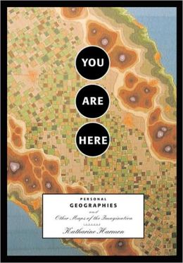
For this literature review I selected two sources, one practical and one fanciful. The practical source is “Digital Map Librarianship: A Working Syllabus” from the IFLA Section of Geography and Map Libraries. The fanciful one is You Are Here: Personal Geographies and other Maps of the Imagination by Katherine Harmon. I actually own a copy of Harmon's book and browse through it frequently.


“Digital Map Librarianship: A Working Syllabus,” IFLA Section of Geography and Map Libraries. Accessed July 24, 2013, http://magic.lib.uconn.edu/exhibits/ifla/.

“Digital Map Librarianship: A Working Syllabus” was prepared by the IFLA Section of Geography and Map Libraries to provide a framework for teaching librarians how to use digital cartographic materials and metadata, developing a collection website and preparing a reference guide. The materials are divided into sections, each of which contain detailed information about a series of subtopics and a suggested citation for further reading.

The “What is a digital map” section compares the function and features of paper versus digital maps and explains basic concepts of digital maps such as raster and vector data, primary and secondary sources, and features of the spatial database like scale, projection, symbols, spatial data quality that may be unique to digital information.

The “Working with geodata” section walks the reader through the process of accessing and downloading digital data from ESRI’s “Digital Chart of the World.” It also provides links to other digital data sources and the user guide for ArcExplorer. Unfortunately some of the links on the website are broken, including most of the external library references and the link to ArcExplorer. According to ESRI’s website, ArcExplorer has been superseded by ArcGIS Explorer, a newer version of the online software. In this case the page directs the user to the updated site.

The section on “Library functions” contains information on developing an online reference guide for users of the library’s digital collection with links to examples from a number of university libraries. It also links to building digital dataset and image collections, storage issues and processing paper collections for digitization.

The “Metadata” section provides an overview to metadata in general A link to the typology of metadata for cartographic and spatial data, including explanations of Band One through Four metadata and a useful chart identifying the purpose and formats for each level of metadata. For example, linking Band One to unstructured data, Band Two to Dublin Core/DTD, Band Three to ISBD/MARC/UNIMARC and Band Four to FGDC, CEN, ISO/Base DTD.

Evaluation

The currency of the information on this website is not optimal. There is no specific ”updated on” date information listed on the site. Clues to the age of the site include the home page, which links to “Past Workshops” dated 1996 and 1997, and section citations, which are primarily dated 1997. This suggests that the site is not maintained regularly, if at all, and accounts for the vast number of broken links. In some cases, such as the link to ArcExplorer, the target page provided a link to the updated page, but most of the library references returned an error page or resolved to the library home page. Oddens Bookmarks has been closed for a number of years. I looked at the IFLA website and found that the Section of Geography and Map Libraries no longer exists and there are no other divisions, sections, special interest groups or special programs on mapping or geography, so it is unlikely that this resource will be further updated.

Overall, this website has value as a historical document and perhaps practical value as a starting point for basic digital mapping concepts and for developing a map collection and reference materials for public use. However, there is surely more up to date information available through organizations, such as the ALA’s Map & Geospatial Information Round Table (http://www.ala.org/magirt/) or the Special Libraries Association’s Geography and Map Section (http://units.sla.org/division/dgm/).


Harmon, Katharine (ed.). You Are Here: Personal Geographies and Other Maps of the Imagination. New York, N.Y.: Princeton Architectural Press, 2004.

You Are Here: Personal Geographies and Other Maps of the Imagination, edited by Katherine Harmon is a selection of essays and full color map images created by writers, visual artists, poets, historians and map enthusiasts. I was interested in this book after having taken a unit on counter mapping in Professor Chris Sula’s Digital Humanities Course. The maps included in this volume are not maps in the sense that they represent a physical reality, but instead use the pictorial imagery of map making as a metaphor for concepts they are meant to depict.

Harmon discusses in the introduction the power that maps hold over our imaginations. She uses phrases like “terrain of imagination” and “contour lines of experience” to highlight how the coded, visual language of maps is an accessible metaphor for human expression. In pointing out the work of creative cartographers infusing maps with humor and the map maker’s particular point of view, she also underlines how even in maps that are intended to represent a physical reality are themselves skewed by the cartographer’s political, religious, or personal objectives.

This volume includes six essays and a number of poems and excerpts from literature, such as passages Lewis Carroll’s The Hunting of the Shark and Roald Dahl’s The BFG, which serve as bookends to the work. I particularly liked Lewis Carroll’s chart of the ocean from The Hunting of the Shark that pictures nothing, but is described as a map “we all could understand.”

The essays include Stephen S. Hall’s memoir of his own introduction to and love of maps and Bridget Booher’s account of a lifetime of bodily injury, represented as a kind of walking tour of her life. Roger Sheffer’s “The Mental Geography of Appalachian Trail Hikers” includes map-like drawings, doodles, instructions and detours that hikers left in guest books at trail shelters along the route. Hugh Brogan discusses the lure of maps in illustrating imaginary places in children’s literature.

Katie Davis’ “Memory Map” describes the old trope about people giving directions to strangers based on where things used to be, such as “…turn left where the big tree used to be before the earthquake,” and explains the urge people have to describe places in personal terms. I connected with this story through the research I am doing on the history of places and what used to be there.

Harmon writes that our attraction to maps is instinctive, that even if a map is of a place we’ve never been or that doesn’t even exist, we understand the image and know what to do with it. The images in this volume are particularly compelling, almost making the essays secondary.  These include memory maps, maps from fictional locations, maps of the human body, and maps that chart behaviors that lead one to heaven or hell or help one find love. Some of the maps are completely imaginary or use familiar shapes, such as hearts or country outlines to walk the viewer through a representation of an idea. Others use existing and familiar maps, such as the London Underground, as a framework for making an explicit statement about data layered on it.

Evaluation

You Are Here is an engaging look at how people use maps creatively to express ideas, opinions or to illustrate imaginary places and themes. It reveals the psychology of maps and spatial representation as a form of expression. As a map library resource, this book would be useful in exploring the choices made in iconography and representation of space. It would be particularly helpful to historians studying antiquarian maps, as some of these, while attempting to document a spatial reality, contain exaggerated or imagined boundaries, fanciful imagery and iconography of political expression. It would also find a place in arts and visual design libraries, literature libraries, as well as social and political science libraries.

Thursday, July 18, 2013

Findings Report: Web Map Resources

The following is a Findings Report on web map resources that I completed as part of a study of NYC Community Gardens for Pratt's Map Institute at the New York Public Library Map Division taught by Matt Knutzen. I reviewed the Library of Congress Geography and Map Reading Room website, GeoCommons and OASISNYC as potential resources for completing this project.


Library of Congress Geography and Map Reading Room
http://www.loc.gov/rr/geogmap/

The Library of Congress Geography and Map Reading Room website contains information about visiting and using the institution’s physical and digital library resources. Major sections of the website include information about the history and background of the Map Division, reference services, digital collections, acquisitions and the Philip Lee Phillips Society friends of the library group.

The center of the page offers links to a featured Map of the Peninsula of Florida by Joan Vinkeboons labeled with the date “[1639?].” Clicking the map opens it in the Division’s map viewer. There are two additional links that open the “new map interface” and an older “American Memory format” which appears to be from a 1999 website design, based on the style and copyright date for many of the materials. The information in the right column contains library hours, “Ask a Librarian” online request form and a current, featured map project, “Places in History: 150th Anniversary of the U.S. Civil War (2011-2115).”

The links were a bit confusing at first since I had expected the label, “Geography & Map Division Map Collections using a new interface,” would link to a press release or a guide to the new interface. Instead it leads directly to the main page of a catalog tool for digital holdings. Unless you start from the general catalog search, most of the linked materials on the Map Division Website retrieve the older, American Memory interface.

The American Memory format link leads to the American Memory project. The interface retains the look and feel of late 1990s web development; however it does contain a useful, browsable subject and title index as well as search. The “Places in History” links also link to the older American Memory interface if you click the map itself. If you click the “more” or “learn more” links you can retrieve more detailed information in a modern interface, including links to the catalog records for cited maps, the KML file in some cases, and a link for ordering reproductions.

The American Memory interface allows you to zoom into smaller portions of a map via JPEG2000 images at various resolutions and zoom levels. The modern interface is the Library of Congress’ general catalog search filtered to the map collection. This includes a search bar with Maps selected and search results showing a summary of listings, including catalog information. Facets allow you to filter by original format, online format, date, collection, contributor, subject, location and language. This integrates the Map collection with the larger LOC catalog, providing access and discovery. An addition to this search page that is unique to the Map Division is tabs labeled “Search Maps” and “Map Collection” which offer the ability to search or browse the collection. Detailed information about the Map Viewers is another useful page included in the Digital Collections section.

From the standpoint of a researcher seeking to utilize the collection, the links on the left column of the home page describing reference policies, guides to the collection, finding aids and a link to the Online Map Collection are most useful. Reference policies describe how one can gain access to the collection and services available including how to obtain a Reader Identification Card, how to make inquiries from a distance and the kinds of copying services available, including reminders about appropriate citation and copyright permissions.

Finding aids and collection guides appear to be similar concepts, though the finding aids, of which there are only three, are EAD encoded resources, while the collection guides list a larger number of topics with web pages hosting brief descriptions and essays. A few, such as the American Women project, are multipage, curated websites. The collection guides are not uniform in layout. Some point to materials in the old American Memory format, while others are displayed in the new format that is browsable by Title, Subject, Audio, Photograph, Drawing, Video, and Written Narrative.

While I expected the NYPL would have more materials that are relevant to my research in community gardens, I wanted to look at the Library of Congress site particularly as a complement to the NYPL resources. I did find an interesting aerial mosaic of the neighborhood where my garden is located from 1929, showing some buildings that are still there and others that have since been demolished or replaced. It is interesting to see that certain surrounding features in nearby Central Park and the relative widths of major versus minor streets are still the same today as they were at the time the photographs were taken, though the paving is clearly of a different quality. Unfortunately, some of the detail is difficult to discern.


GeoCommons
http://geocommons.com/

GeoCommons is a public community website of ESRI GeoIQ users, who according to the website, "are building an open repository of data and maps for the world." The GeoIQ platform includes a features for uploading, accessing, visualizing and analyzing data. Some of these features include the ability to create and share custom maps with layered data and animations through time and space. The platform allows you to upload your own data, and it will create statistics that you can analyze and download in many formats, including CSV, KML, ESRI Shapefile, JSON and Atom. Additionally, site viewers can search for and access your map, filter the data, copy it to their own accounts so they can add or modify the data and share the results.

GeoCommons serves as an introduction to ESRI's GeoIQ enterprise edition which contains more powerful predictive analytics tools, integration with social media and the ability to keep data private and to manage access and workflow. Data can be stored in the cloud or hosted on a virtual machine. GeoIQ Connect can integrate with Oracle, MySQL, PostgreSQL, ESRI, MongoDB, and other datastores and APIs. Also, a free developers kit allows you to create custom applications that integrate with GeoIQ.

Reviewing GeoCommons from the perspective of a community garden organizer, it seems that the free version would be sufficient for most uses. Gardens could be plotted on a map and compared to surrounding land uses and current and proposed planning and construction projects. Individual gardens might like to use GeoCommons to create plot maps of members’ beds. My local community garden recently installed a beehive, so it would be an interesting project to plot areas where bees are found in the garden.

Most community gardens are not large enough or rich enough to purchase an enterprise edition; however, if it were purchased by the City Parks Department, it could conceivably be used to host and manage users who are affiliated with the department's Operation Green Thumb gardening program. Advocacy groups might like to use it to promote development of gardens in areas of greatest need. For example, the NYC Parks Department website indicates that many community gardens have historically been created in areas where access to open public spaces is limited. An existing NYC community garden map on the GeoCommons site shows a concentration of gardens in the Lower East Side and East Harlem in Manhattan and Bedford-Stuyvesant and East New York in Brooklyn.

As a research and reference tool GeoCommons is limited to the datasets that have been uploaded by site users. ESRI offers a search tool for discovery and showcases featured maps, but there is no formal index and the community of maps run the gamut from formal studies to test runs, such as the one I created to play with a community garden map that I found. As a tool for teaching basic GIS skills, the site is quite useful. It is very easy to upload data and play with the basemap and icons, and the download formats offer a way to work easily with spreadsheet views or Google Earth.


OASIS
http://www.oasisnyc.net/map.aspx

OASIS map focuses in open space in New York City. It is maintained by the Center for Urban Research at CUNY Graduate Center.  It was one of the first maps created specifically to address the low ratio of open space per citizen. It is an excellent research tool for highlighting open space and comparing to surrounding land uses.

OASIS is a collaborative project between CUNY and a number of data providers including the US. Army Corps of Engineers, the Wildlife Conservation Foundation, the Stewardship Mapping Project, the USDA Forest Service, the Manahatta Project and the Council on the Environment of NYC’s community gardens program. The diversity of partners, most of whom contributed data to analyze specific problems, is a testament to the various use cases and array of visualizations possible with this tool. The platform that OASIS runs on is ESRI ArcGIS Server with OpenLayers open source map viewing library and Javascript web framework, JS Ext.

In addition to open space and land use data, OASIS includes data layers showing transit lines, such as roads, subways, bus lines and bike routes; environmental data such as coastal storm impact zones, Forever Wild sites, and public access waterfronts; environmental impact zones, such as brownfields, hazardous waste treatment centers and volunteer cleanup sites; social services such as schools, libraries, and NYCHA and subsidized housing properties; as well as zoning, population characteristics, water and wetland areas, political boundaries and historical datasets.

It is possible to overlay data onto historical aerial photography from 1996 to 2008 via a slider interface. Also, because the map is linked to the Manhatta project, you can display recreated aerial landscapes from 1609 and overlay it with data from that period, including wildlife habitats, Lenape Indian trails, eco-community data and shorelines. Additional historic overlays include Montresor map from 1775, the Poppleton map from 1817, the Viele map from 1874, and the Bromley Atlas from 1911 (all maps from New York Public Library).

It is a powerful discovery tool. If you select a property on the map, the Location Report tab offers detailed information about the property, including tax block and lot information, owner, property dimensions, like building area, number of units and whether commercial space is included, political and community district information and other relevant information. It also has direct links to the property’s Zoning Map, NYC Dept. of Buildings and transaction records, tax assessment, the  Digital Tax Map, NYC zoning guide and NYC Watershed Resources.

OASIS is a good website for garden organizers. In fact, the community gardens project was one of the earliest projects that ran on OASIS. It lists community garden search as one of the main features on the homepage, along with special searches for stewardship organizations, such as block associations and historical societies. It functions well as a directory for these kinds of community organizations since the metadata may include contact information, website address, hours, membership and other pertinent information about the entity in addition to property information such as ownership, block and lot number and political jurisdiction.

Friday, July 12, 2013

Exhibit Review - “The ABC of It: Why Children’s Books Matter” at the NYPL

The ABC of It: Why Children’s Books Matter” at the New York Public Library covers the history of children’s literature from three centuries of items in the Library’s collection, and explores how children’s literature exposes society’s understanding of how a child learns and the social and moral priorities of children’s education at a given period of time.

The question asked in the first hall is “Are children born innocent or sinful?” The earliest books for children included reading primers from the early Eighteenth Century, reflecting Cotton Mather’s view that children’s books should reflect moral ideals. This idea contrasted with alternative views by John Locke, who felt that children needed stories that would delight and entertain, and Jean-Jacques Rousseau, whose idea was that children should be given only the bare truth. The question “What should children read?” is woven throughout the remainder of the exhibit as we are taken through the Library’s collection of children’s books into the modern day.

The second gallery presented a sampling of books that represented an evolution of thinking about children’s literature, “From Rote to Rhyme.” Examples included Eighteenth Century, British publisher, John Newberry’s, readers and his thoughts on equal access to children’s literature; and the Dick and Jane series, which promoted whole word reading but was later criticized as presenting white, middle class American values and identity that did not represent the diversity of experience in the United States at the time. Other examples, such as Dr. Suess’ The Cat in the Hat and James Stephens’ Irish folk tale, Carl of the Drab Coat, represented departures from more rote styles of reading, featuring fun and adventure in the texts.

The next gallery explores national and ethnic identity with works from Noah Webster, who championed a uniform American spelling system, to state run publishers from Russia and China, Japanese manga style readers for Japanese-American children during the WWII internment and post-colonial French West Africa. Twentieth century approaches such as The Bank Street School and Maria Montessori’s teaching methodologies are also explored.

As the rise of public libraries in the late nineteenth century led to greater readership among the masses, more and more titles, including young adult series and materials specifically published for gift-giving appeared. The exhibit explores popular characters, such as Winnie the Pooh, showcasing the original stuffed animals that inspired the stories, as well as Beatrice Potter and the Nancy Drew series. A brief presentation of movie and toy tie-ins and the commercialization of children’s literature came next. While the current exhibit is primarily about the Library’s book collection, rather than TV shows, an exploration of the impact of audio and video on education would have been interesting, as the Library’s collection contains a collection of children’s media in addition to books. Perhaps that would be an entire exhibit unto itself.


Throughout the exhibit, the halls contain playful structures, representing featured stories, and included interactive features, such as audio, iPad presentations and hands-on manipulatives. The first of these, near “From Rote to Rhyme,” is a large display featuring Norton Juster’s The Phantom Tollbooth and Jules Feiffer’s artwork. This interactive presentation includes a wall mural, a car that visitors can sit in and wheels where visitors can play with words from the story. In the next room, a display for Charles Lutwidge Dodgson’s Alice in Wonderland shows Alice’s neck comprised of a stack of books opening and extending toward the ceiling. A large gift box containing the Little Golden Book, The Pokey Little Puppy is located in a section on gift giving and a later room, a hedgerow represents Frances Hodgson Burnett’s The Secret Garden. My favorite was the crown from Maurice Sendak’s Where the Wild Things Are, which was bright yellow on one side and dark fur on the other and had a doorway cutout of a wild thing.

It wasn’t until I had passed through these rooms and noticed these featured displays, however, that I tied the presentation of the book, The Phantom Tollbooth, in the second gallery to its interactive display. I recall originally thinking it odd that the book, The Phantom Tollbooth, was set off in a case by itself, though I understood it to be a representation of playful subversion of educational theories, which the gallery addressed. I went back to it to take a closer look. I realized that perhaps because I viewed the gallery beginning with the Newberry display instead of the Rote to Rhyme case that a jump to the mid-twentieth century might have been a bit incongruous. Also, the label for The Phantom Tollbooth display was somewhat hidden on the side of the glass case holding the book, instead of next to the interactive display.

The incongruity of The Phantom Tollbooth display was really the only major criticism I had of the exhibit as a whole. The library did a good job taking the visitor through a history of children’s literature through the evolution of educational theory to the rise of the public library and the democratization of reading to the commercialization of the book industry. A section on children’s book illustration, set apart in a side gallery, was a lovely exploration of artwork in children’s literature and the last gallery on New York City themes brought the visitor back to the local area just as they are about to step back out into the city itself.

The final room contained a video quiz on the entire exhibit, which was a clever way to circle back to the theme of children’s education and ask the visitor “What have you learned today?” Unfortunately, the library was closing so I didn’t have a chance to play with it.

“The ABC of It: Why Children’s Books Matter” will be at the New York Public Library, Schwartzman Building at Fifth Avenue and 41st Street until Sunday, March 23, 2014. The exhibit is free and open from 10am to 6pm Mondays, Thursdays and Fridays and 10am to 7:30pm on Tuesdays and Wednesdays.

Friday, May 10, 2013

SILS Student Showcase

I was nominated to present three projects at the Pratt SILS Student Showcase on May 10, 2013, including a review of technology platforms for a digital humanities skillshare application; a group project on linked open data at cultural heritage institutions in which I studied the Australian War Memorial, EU Screen and the Deutsche National Bibliotek; and a group project on folksonomies and social tagging in museums, which was presented at the 2013 Information Architecture Summit.

A Survey of Digital Humanities Skillshare Applications, nominated for the Pratt SILS Showcase:

The DH skillshare website is available here: DH Skillshare

Linked Open Data for Cultural Heritage, group project nominated for Pratt SILS Student Showcase. Poster, presentation and paper below.

LOD for CH Poster:

LOD for CH Presentation:

Paper: Linked Open Data for Cultural Heritage
By Jeff Edelstein, Lola Galla, Carolyn Li-Madeo, Julia Marden, Alison Rhonemus, Noreen Whysel
Abstract: This paper surveys the landscape of linked open data projects in cultural heritage, exam- ining the work of groups from around the world. Traditionally, linked open data has been ranked using the five star method proposed by Tim Berners-Lee. We found this ranking to be lacking when evaluating how cultural heritage groups not merely develop linked open datasets, but find ways to used linked data to augment user experience. Building on the five-star method, we developed a six-stage life cycle describing both dataset development and dataset usage. We use this framework to describe and evaluate fifteen linked open data projects in the realm of cultural heritage.

Download the paper: Linked Open Data for Cultural Heritage

Poster: Folksonomies and Social Tagging in Museums, created with Kathleen Dowling and Dana Hart and presented at the 2013 Information Architecture Summit in Baltimore on April 5. This poster was nominated for the Pratt SILS Student Showcase on May 10:

The companion presentation, Folksonomies in Museums and other recent presentations are available at Slideshare.

Monday, April 08, 2013

IA Summit Poster Session

My poster: Folksonomies and Social Tagging in Museums, created with Kathleen Dowling and Dana Hart was presented at the 2013 Information Architecture Summit in Baltimore on April 5. This poster was also nominated for the Pratt SILS Student Showcase on May 10:

The companion presentation, Folksonomies in Museums and other recent presentations are available at Slideshare.

Wednesday, February 13, 2013

World IA Day: City Data

I had the chance to fill in for Andrew Nicklin, NYC Director of Research and Development at DoITT, at World IA Day on February 11, 2013. The event was held after Winter Storm Nemo hit the region. We had anticipated up to 330 attendees, but the storm knocked out commuter trains, and road conditions in New Jersey and upstate New York kept many home. Still, an unexpectedly large crowd of 130 came out to celebrate Information Architecture.

I presented an updated version of my IA for Emergency response presentation, this time focusing on the collection and dissemination of city data and community engagement and how information architects and design professionals can participate.


Information Architecture and City Data from Noreen Whysel

I am working on a collection of presentations and talk summaries that will be posted to the World IA Day website.

Tuesday, January 29, 2013

Digital Humanities and Archaeology

Presentation to Digital Humanities class at Pratt Institute, covering the history of computing in the field of archaeology and current digital humanities projects.


Thursday, December 13, 2012

Folksonomies in Museums

Kathleen Dowling, Dana Hart and I presented on Folksonomies in Museums, our final project for our Knowledge Organization class. Below are the presentation slides and poster.


Friday, November 30, 2012

Archiving Digital Maps

An excerpt and presentation from an academic paper on archiving digital maps:


I have been a member of the Geographic Information System (“GIS”) community in New York City, since the early 1990s when I was a real estate researcher at Price Waterhouse. In those days, except for certain Federal departments, like the US Census, geographic data was largely held by the institutions that created it. Datasets were static, finite and, until the advent of DVDs and the World Wide Web, difficult to share, due to their often massive file size and the slow speed of internet file transfer. The sharing that did happen was informal, occasional, and often blocked, inadvertently or deliberately, by agency policy or licensing terms that restrict third party distribution. Census data and commercial products, such as demographics tables from Sales & Marketing Magazine, were available at the New York Public Library on tape, microfilm and later on DVD, but more proprietary data sources were often obtained through expensive licensing agreements or barter and a network of “who you know.” The GIS user group, GISMO, formed in 1990, was one place where such sharing occurred.

GISMO was originally created as a software user network where GIS professionals shared information on GIS tools and applications and presented projects at informal bi-monthly meetings. At the time that GISMO was formed, NYC agency geographers were frustrated with the lack of centrality of geographic data at the City level. There was no common base map of New York City on which to overlay geospatial data and no City library where geospatial resources were archived and available for extensive employee use. To address this problem, GISMO offered the following data advocacy statement:


GISMO supports freer access to data through interaction between NYC area GIS users as well as the following long range initiatives:
  • Developing common electronic base maps for GIS users in NYC.
  • Facilitating the data distribution among city agencies and between the public and
    private sector.
  • Coordinating local information systems for synergy, economy, and accuracy.
  • Providing GIS resources to technologically isolated organizations.

In this paper, I will take a look at the access issues that led a group of geographers to work toward developing a centralized data repository for New York City and how these efforts were mirrored and extended at the national level. While I learned a lot about GIS metadata and software, I will focus more on policy issues around the management of geographic data collections and then discuss archiving management issues more generally. I will avoid delving deeply into political themes around data access and control, though they do have a role in the history of geographic data and how public release and archival decisions are made. I will present information on early data clearinghouses and website archives which provided examples for more robust archival programs at local and national institutions, including NYPL, the Library of Congress, Data.Gov and the NYC Open Data initiative. I will also look at the cost of data, economic limitations on access and the promise of open data.

Full paper (.DOC 145.9kb)


Monday, September 10, 2012

Monday, July 23, 2012

GeoSprocket Live Survey on GIS Tools


The first round of results of a recent GIS user poll from GeoSprocket, asking about GIS tool used and frequency of use, are available:

Bill Morris surveyed GIS users via several feeds including a Vermont GIS listserv, ESRI and O'Reilly conference hashtags and the author's social media accounts. An interesting survey, but difficult to get a good read on who the sample represents. Not knowing how many people follow a specific Twitter hashtag, it is difficult to measure how many of the respondents might have found the survey via the ESRI versus the O'Reilly hashtag.

With those caveats, let's look at the numbers.

In the first release, 55% of the respondents are primary ESRI users, 24% use open source GIS tools, 16% are Google Map users and 8% use some other tool, including FME, MicroStation, ENVI/IDL, GIS Cloud, AutoDesk, Maptitude, Idrisi, Mapserver, Geocortex and others. Bill noted surprise at how many Google users there are. Frankly, I would have thought there would be more, but perhaps Bill's social network skews toward ESRI or that more people follow the ESRI hashtag than the O'Reilly one.

Overlap in product use is what I find most interesting about this survey.  It seems a larger proportion of people who use non-ESRI tools like Google Maps or open source products also use ESRI tools (80% versus 40%). However, 75% of ESRI users also use Google Maps. This  indicates that there is value for a lot of people in using a mixed approach.

The second round of Bill's survey remains open and live results indicate that there are indeed more Google users than the first round suggested. As of today, ESRI users remain the majority with 48% of users versus 30% Google Maps. The other categories are relatively the same.

It will be interesting to see how these numbers change as more people enter the survey.

It would also be more interesting and indeed useful to see why certain tools are used over others as opposed to simply which tools were used. Clearly with up to 80% overlap of use there must be reasons why certain tools are chosen for certain tasks. Hopefully, Bill will add that question in a subsequent survey.

Friday, July 13, 2012

Information Architecture of Emergency Response (for Designers)

My IxDA July 12 presentation on Information Architecture of Emergency Response (for Designers) is now available at: http://www.slideshare.net/nwhysel/information-architecture-of-emergency-response-for-designers. Thanks to IxDA and Pivotal Labs for hosting, Peter March for MCing and Jennifer Kilian at Hot Studio for bringing the pizza.

Tuesday, May 29, 2012

The Information Architecture of Emergency Response

Now that I have been accepted into the Pratt Institute Masters of Library and Information Science program, I have started a journey to document the convergence between two of my favorite disciplines, Geographic Information Systems and Information Architecture. In the past few months, I've noticed an explosion of conferences and meetups addressing the geolocational aspects of digital applications for the web and especially mobile. I am a member of 16 different Meetup groups, eight of which address some aspect of the User Experience umbrella, four of which specialize in mapping and/or GIS, two somewhat general technology groups and two more that approach these disciplines from the fascinating perspectives of digital semiotics and data visualization and infographics. Each have hosted topics on user experience and location based design at some point. Many maddeningly scheduled for the same evening.

Commiserating with some of my colleagues with whom I helped create the NYC GeoSymposium 2001-2011-2021 back in November, we have found that in each of our practices, cartographers, GIS specialists and those working with visualizing location based information are finding a great need for design assistance. This seems natural, if somewhat belated and perhaps even surprising. Think of some of the most beautifully designed images and one must of course reflect on the maps of National Geographic magazine, those gorgeous squares of folded paper that come in every issue. Certainly, there is a longstanding sensibility around the design of useful and pleasing maps. Increasingly, these maps are in our hands on tablets and smart phones, so optimizing the display of information that used to be represented in enormous, rolled or folded pieces of paper is a challenge for our community.

Let's Talk About Maps

So I am doing my part in continuing this discussion of the place for design in online mapping. In March, I presented a talk in New Orleans at the 2012 IA Summit on The Information Architecture of Emergency Response. The presentation explored the evolution of technology in emergency response, with a special focus on advances in geographic systems, incident management, social media and policy in New York City since September 11, 2001. In it, I cover questions like:

  • What technologies do emergency responders in NYC use?
  • How have events like 9/11 and other incidents influenced technology advances?
  • What effect, if any, has the change from a Law Enforcement Mayor to a Media Mayor had on data policy?
  • What are the challenges and opportunities of open government data?
  • How is social media being used in NYC and elsewhere to engage the public in emergency preparedness and response?
  • And, finally, are app contests and hackathons an effective way to improve public services in difficult economic times?

I reprised the presentation, modified somewhat for an emergency responder audience for the Office of Emergency Management's annual Women's History Month Breakfast, where I had the pleasure of sharing the stage with Dr. Irene Osborne of Mount Sinai Hospital, who treated patients' internal injuries during the Haiti earthquake, and IA Institute founder and Development Manager, Bev Corwin, who presented on language translation in crisis situations, in particular a handheld Creole language translation device that she developed with colleagues at Carnegie Mellon University.

Continuing the Discussion

I have been asked to present another redux of Information Architecture of Emergency Response at the IxDA NYC's July meetup. I hope to conclude the IxDA with a Town Hall discussion of how the IA community can support emergency response efforts throughout each of our own neighborhoods. I ran out of time in New Orleans and would like to get a good conversation going with the UX community on issues and ideas for further exploration. My daughter's 6th grade graduation is June 7, so I will be missing the IxDA meeting that focuses on the Social Lives of Maps, with UX designer Ray Cha and Green Map's Thomas Turnbull. But I understand the GIS community will have someone there. If you attend, please introduce yourself to Jack Eichenbaum, who founded GISMO, a 20+ year old, NYC-based GIS user group. In the meantime, stay tuned for RSVP information for the July event.

It may also be interesting for my UX friends to hear (as I've heard through the grapevine) that ESRI, leader in GIS software, is developing an internal UX practice and should be hiring soon.

Slide decks of my IA of Emergency Response talks are now available at Slideshare:

March 23:
March 28:

Tuesday, January 24, 2012

Towards a 9/11 GeoArchive

Imagine if the most graphic and expressive artifacts from one of the most historic events in New York City lay rolled in tubes in a dusty corner. What if millions of bytes of geographic data, produced through an unprecedented, community collaboration, were dispersed, disconnected and hidden from public view? If you had the opportunity to preserve them, how would you do it?

During the September 11, 2001 rescue and recovery operations, I volunteered to help recruit geographers through a NYC-based GIS user group, called GISMO. The need was critical and overwhelming. The Mayor's Office of Emergency Management had been evacuated and no longer had access to maps and data necessary for the rescue effort, and if that wasn’t bad enough, they lacked the number of skilled hands to produce the hundreds of maps per day required by the unprecedented event. At this point, GISMO had been working for years to advocate for data sharing and cooperation among city, state, non-profit and private entities, and developed into a 400 strong social network. Hundreds of volunteers, many from GISMO, stepped forward. This effort served as a highly regarded, if anomalous, model for unified response in years to come. But the artifacts from this effort have not been preserved in any curatorial sense. I'd like to change that.

I recently participated in the NYC GeoSymposium 2001-2011-2021, which took a look at the advances and challenges of Geographic Information Systems in emergency response since 2001. Around this time I had been thinking very hard about my career goals and ways to combine my past experience in research and design with the grassroots efforts of the geographic community. I had been working with colleagues at GISMO for many years to draw attention to the important role geographers played in the 9/11 rescue and recovery. The GeoSymposium was a great experience, because it intended not just to honor those who participated in these efforts, but also to highlight the need to preserve the thousands of maps that tell the story.

My own contribution to the GeoSymposium was to explore the legacy of these efforts by examining the technological improvements at the Office of Emergency Management in the context of emergency events that had occurred since 2001. I was looking for a way to present time-based information in a map format and also to start a conversation with attendees about the history of emergency response technology and the importance of the preservation of geographic artifacts. My project contained a map of New York City with events plotted and color-coded by discrete periods, characterized by a common group of new technologies. An online version of the map is available at ArgGIS Explorer Online.

Map Detail Slides

The map highlights how the events surrounding 9/11 prompted improvements in incident management technology. Attendees, including the keynote presenter and eminent information designer, Edward Tufte, gathered around to discuss their experience with the events I had mapped and to offer advice on ways to enrich its design. (Some of Mr. Tufte’s comments led to further improvements which you can see via the links above.)

Simply talking about how to improve the map was an exercise in exploring history and memory: how people understand what happened, how events are related to one another, how what you choose to include and what not to include can influence a person’s understanding of the events, how the description of one event can bring to mind another similar one, etc. It was thrilling to observe the spontaneous conversation that started all because of a three by four foot piece of foamboard.

And that’s just one artifact. In the aftermath of 9/11, hundreds of maps were produced – Every Day – for months. The 9/11 geographic effort represented a level of cooperation not seen before or since, but whose legacy, coupled with improvements in technology platforms themselves, informs the open data initiatives we are now seeing throughout the U.S.

Of course, the artifacts of the 9/11 response have historical value by themselves. And that is where the images of dusty, neglected rolls of paper come in (even though most of the maps are on disks and hard drives). Several of my GISMO colleagues and I are exploring a plan to create a 9/11 Geographic Archive, featuring the maps that were produced during the rescue and recovery effort. I plan to present an outline of the 9/11 Geographic Archive and my map of emergency response technologies at the ASIS&T Information Architecture Summit in March 2012. Such an archive would be an important contribution to the history of emergency response in this country.

I have always loved presenting information in meaningful and digestible ways, whether through maps, market research reports, drawings, websites or online resource libraries and intranets. From very early in my career, I have been driven to present information in a coherent way and to seek out tools and processes that make coming to understanding easier. I am thrilled by the convergence that today's state of technology allows between geographic tools and the digital storytelling of the user experience discipline. What is really great about this project is that I will be able to combine aspects of two fields that I love into an end product that would have meaning for many now and in years to come.

So, if you had the opportunity to preserve artifacts from an important event in New York City history, how would you do it? Some of the groundwork has already begun. I have been working with a mentor to explore relationships with organizations that support technology projects in the digital humanities, and with museums and libraries that share an interest in geographic artifacts and 9/11. I am building on my relationships with the City’s amazing geographic community through GISMO, the thirty Geosymposium presenters who told the 9/11 story and senior staff at the Office of Emergency Management and other consultants who have expressed interest in an archive. (I have even applied to an information science program where I hope to explore this project further). Finally and perhaps most importantly, I have the support of members of the GISMO Steering Committee to pursue further resources and trainings to develop the framework for an archive entity. With that grounding, I can turn the question "How would you do it?" into "When can I start?"

Thursday, December 22, 2011

9/11 Geosymposium at Technology in Government 2011, New York

The NYC GeoSymposium: 2001-2011-2021 held on November 16, 2011 marked the tenth anniversary of the September 11th attacks by examining the response of the NYC GIS community regarding mobilization of geospatial resources after the event, evolution of procedures, data and technologies since the event, and exploring unmet needs for improved emergency planning and response, as well as future challenges posed by emerging social media and enterprise-wide deployment of software and hardware advances that underpin geospatial application development. I worked with several of my colleagues at GISMO to produce this event, which was co-located with NYC GovTech 2011. We will be launching a GIS design challenge in Spring or Summer 2012. Stay tuned.

Monday, December 12, 2011

World IA Day Announces 14 Locations

World IA Day has just announced 14 locations for February 11, 2012

1 DAY. 14 CITIES.
World IA Day 2012 is about bringing the Information Architecture community together. We’re fostering links within local communities and on a global scale. We’re sharing information, ideas and research. And we’re doing it through unconventional, exciting and engaging IA events this February.

The first ever World IA Day focuses on Designing Structures for Understanding. On February 11, 2012, we’re hosting WIAD events in 14 cities across all corners of the globe. Learn from world-class IA minds, network, showcase new ideas and attend events tailored specifically to your community. We hope you’ll join us at an event near you this February!

Local Connections. Global Impact. World IA Day 2012

WIAD2012 Locations:

Bogota, Colombia
Vancouver, Canada
Sao Paulo, Brazil
Los Angeles, CA, USA
Ghent, Belgium
Kuala Lumpur, Malaysia
Italy (Milan, Rome, Sardegna)
Panama City, Panama
Bucharest, Romania
Paris, France
Sydney, Australia
Malmo, Sweden
Johannesburg, South Africa
Tokyo, Japan
Ann Arbor, MI, USA

Visit http://worldiaday.org/ for details.